Scatter chart
A scatter chart uses dots to show the relationship between two variables.
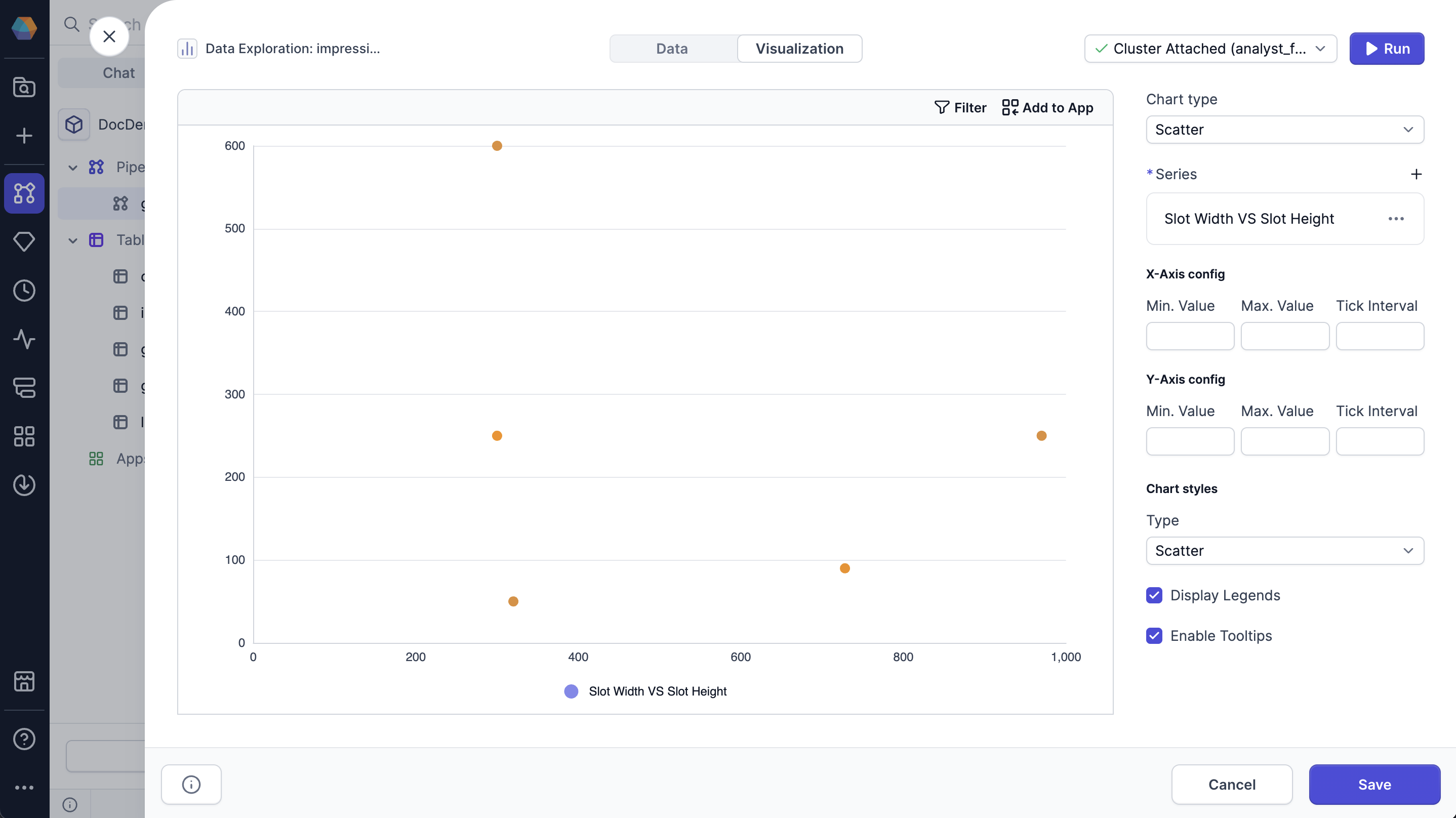
You can configure the following parameters for the chart:
| Parameter | Description |
|---|---|
| X-axis config | Configuration for the X-axis, including min value, max value, and tick interval. |
| Y-axis config | Configuration for the Y-axis, including min value, max value, and tick interval. |
| Chart style | Style of the chart, either scatter or bubble. |
| Display Legends | Whether to display the legend on the chart. |
| Enable Tooltips | Whether to display tooltips on hover. |